Advanced CSS
Advanced CSS is a powerful way to add more advanced and nuanced customization to Askribe consumer using SCSS code. We expose classes that are used in consumer to enable styling customization using Advanced CSS. The classes exposed are as follows. These are the classes exposed in Reel View.
SCSS Version used: libsass 3.6.5 Syntax Documentation
Block Selection Classes
These classes are added to the root element of each block. These classes are also applied to the root element of each Form Item in a Form block. These classes are added to the blocks based on block type. Unless specified, these classes are applicable for blocks and blocks appearing as Form Items.
The header, footer and action buttons are not included in the element selected block. If you want to include these element, use .askribe-fg or .askribe-consumer
The class names and the block types that they are applicable are as follows
| Class Name | Applicable blocks |
|---|---|
askribe-block | All blocks except form |
askribe-statement | Statement block |
askribe-question | All interrogative blocks: Captcha, Signature, Ask Contact, Ask Location, Rating, MCQ, Ranking, Date / Time, Text Answer, Capture Media, Upload, Matrix and UX |
askribe-welcome | Welcome block |
askribe-mcq | MCQ block |
askribe-ranking | Ranking block |
askribe-text-answer | Text Answer block |
askribe-capture-media | Capture Media block |
askribe-date-time | Date Time block |
askribe-rating | Rating block |
askribe-matrix | Matrix block |
askribe-ux | UX block |
askribe-signature | Signature block |
askribe-upload | Upload block |
askribe-thanks | Thanks block |
askribe-captcha | Captcha block |
askribe-ask-location | Ask Location block |
askribe-ask-contact | Ask Contact block |
askribe-send-location | Send Location block |
askribe-send-contact | Send Contact block |
askribe-send-sticker | Send Sticker block |
askribe-whatsapp-template | WhatsApp Template Message block |
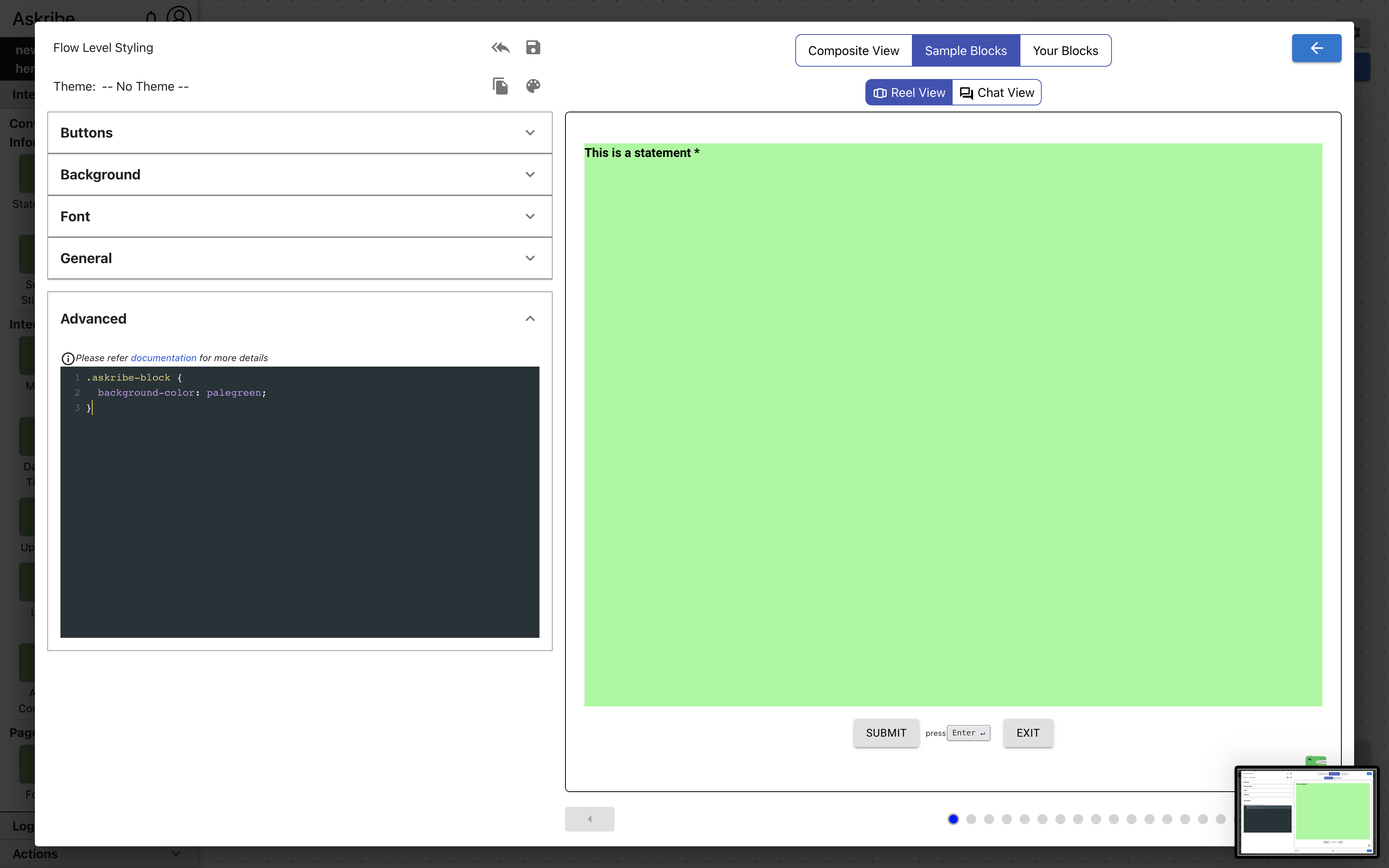
Example 1
Code
.askribe-block {
  background-color: palegreen;
}
Result
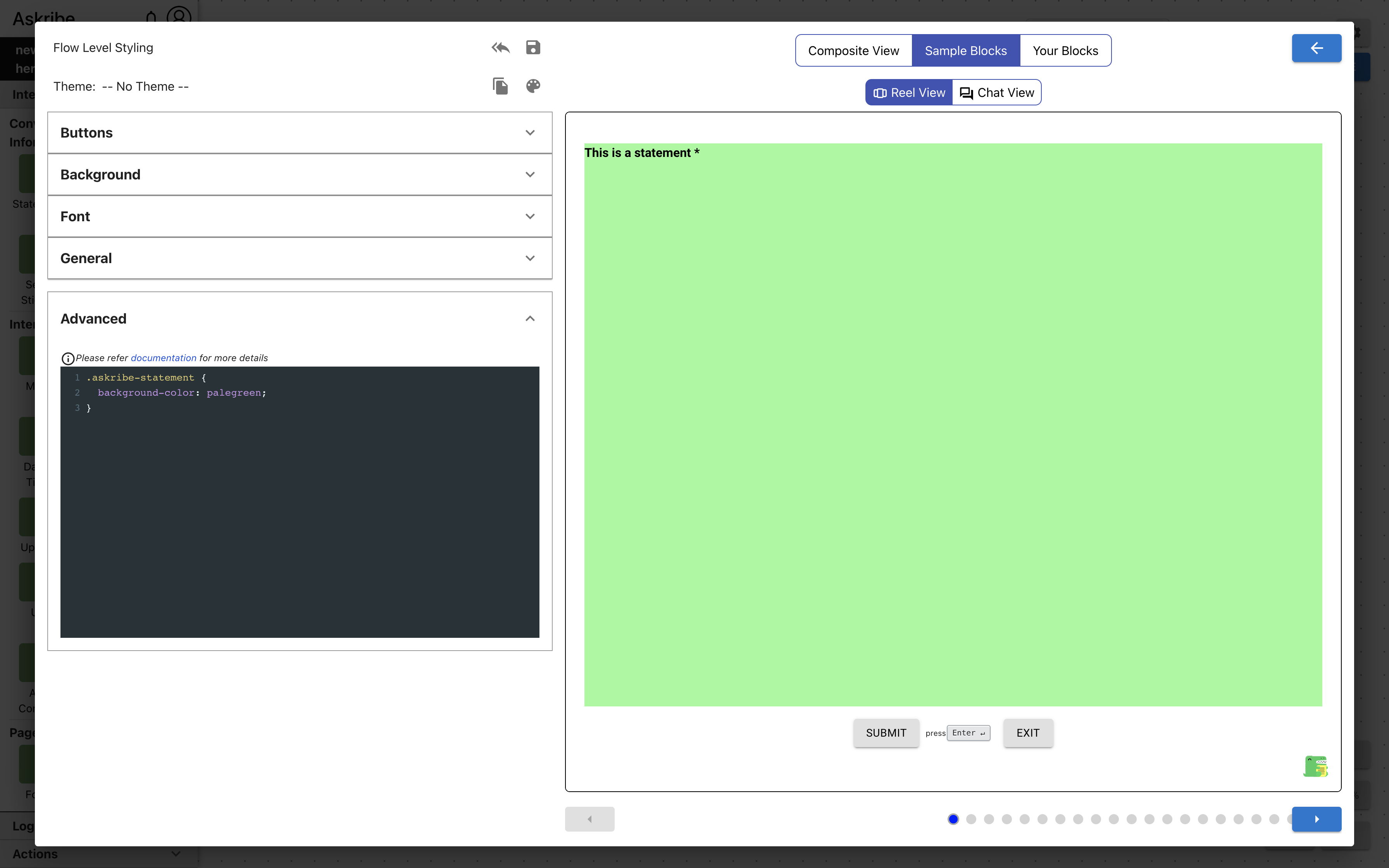
Example 2
Code
.askribe-statement {
  background-color: palegreen;
}
Result
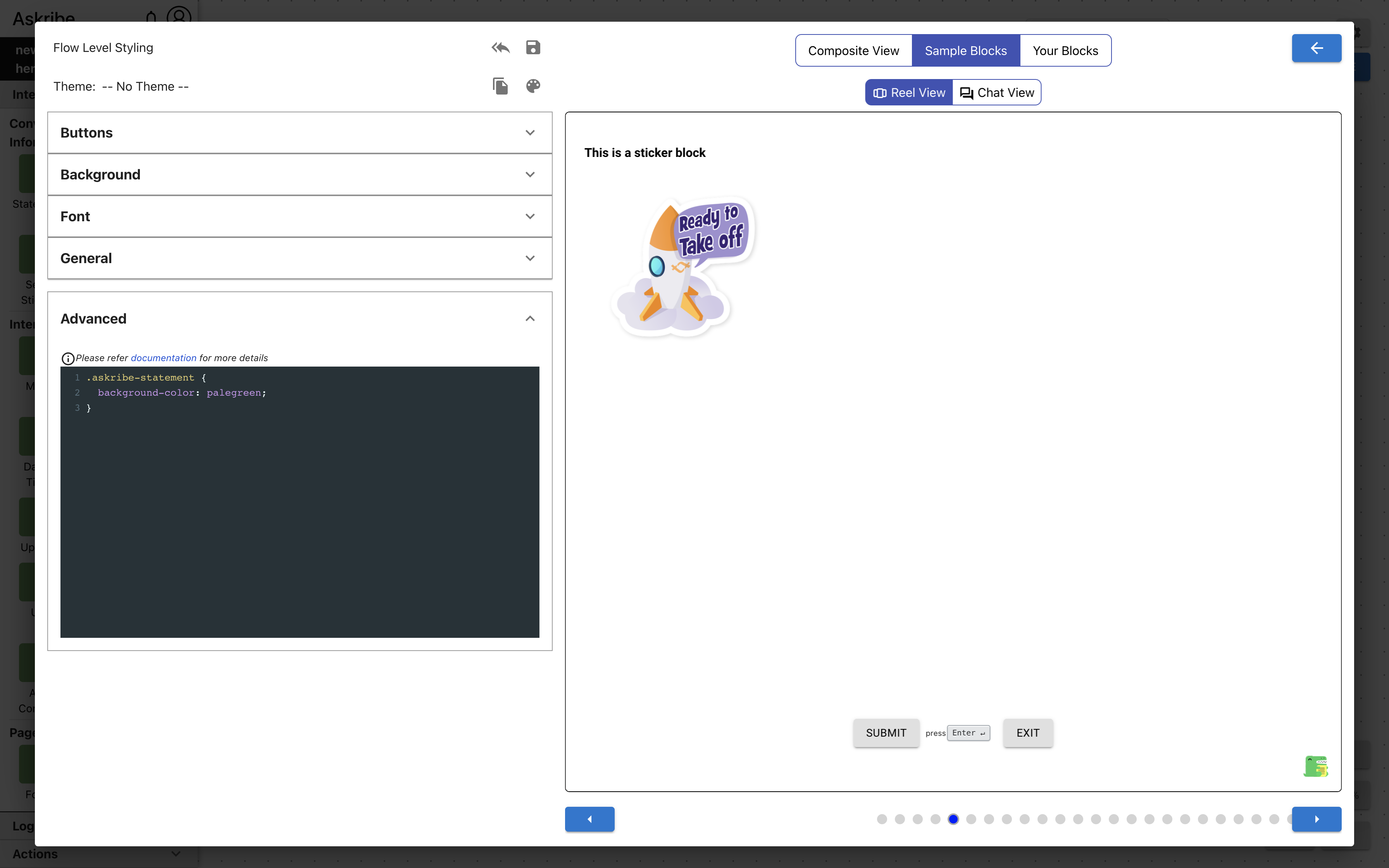
This applies a pale green background to Statement Blocks
The other blocks, such as the Send Sticker Block below, remain unaffected.
Form Block Classes
The following classes are applicable for a Form block
| Class Name | Applied To |
|---|---|
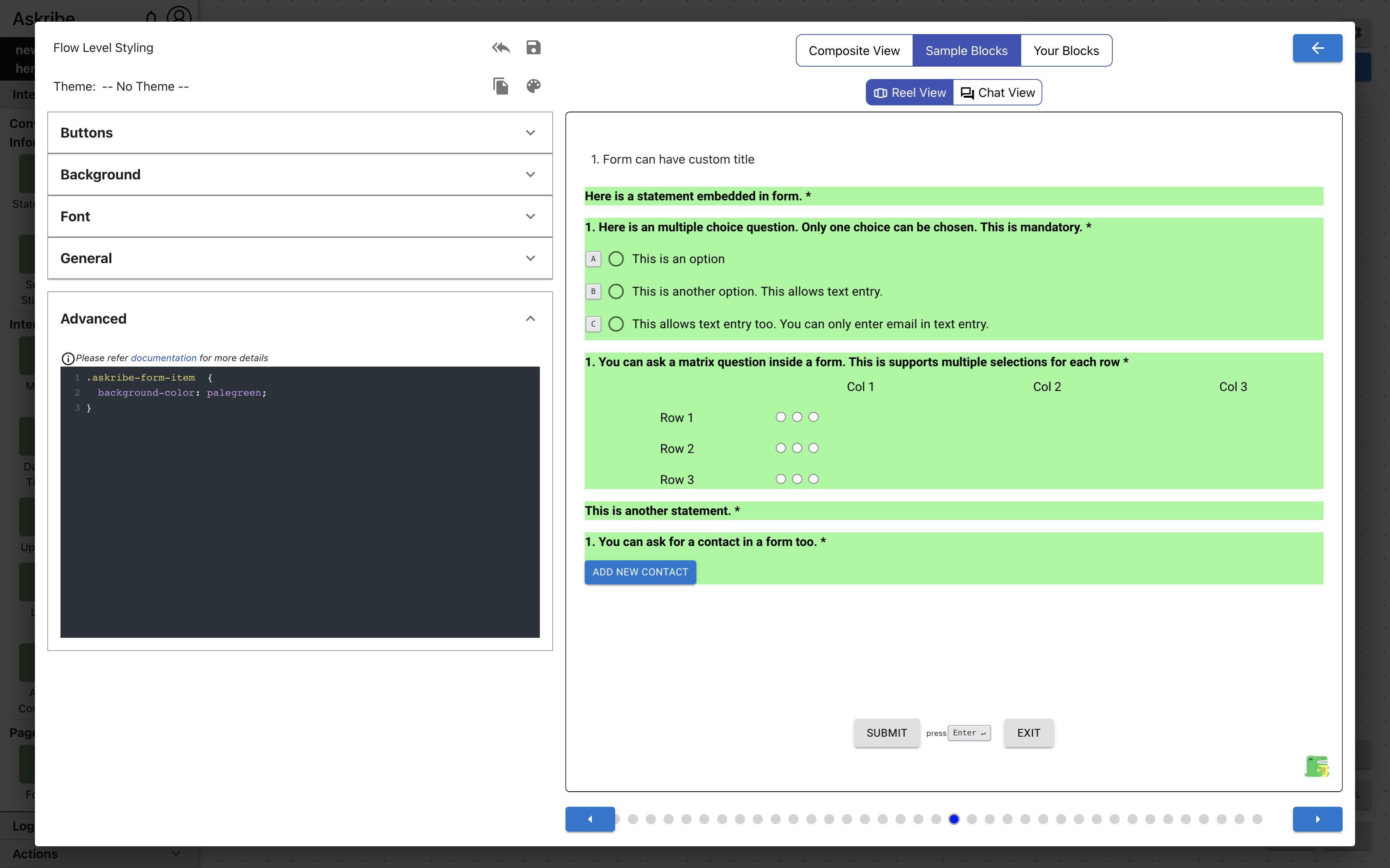
askribe-form-container | The root element of a Form block |
askribe-form-item | root element of each Form Item |
askribe-form-title-container | The element containing Form block title |
aaskribe-form-title | Form block title |
askribe-form-button | The submit button if the displayed block type is Form |
.askribe-form-title-container includes previous and next block links along with the Form block title. .askribe-form-title
only includes the Form block title.
Example 1
Code
.askribe-form-container  {
    background-color: palegreen;
}
Result
Example 2
Code
.askribe-form-item  {
    background-color: palegreen;
}
Result
Welcome Block Classes
The following classes are applicable for a Welcome block
| Class Name | Applied To |
|---|---|
askribe-welcome-btn | Welcome block submit button |
Thanks Block Classes
The following classes are applicable for a Thanks block
| Class Name | Applied To |
|---|---|
askribe-thanks-btn | Thanks block submit button |
Text Answer Block Classes
The following classes are applicable for a Text Answer block
| Class Name | Applied To |
|---|---|
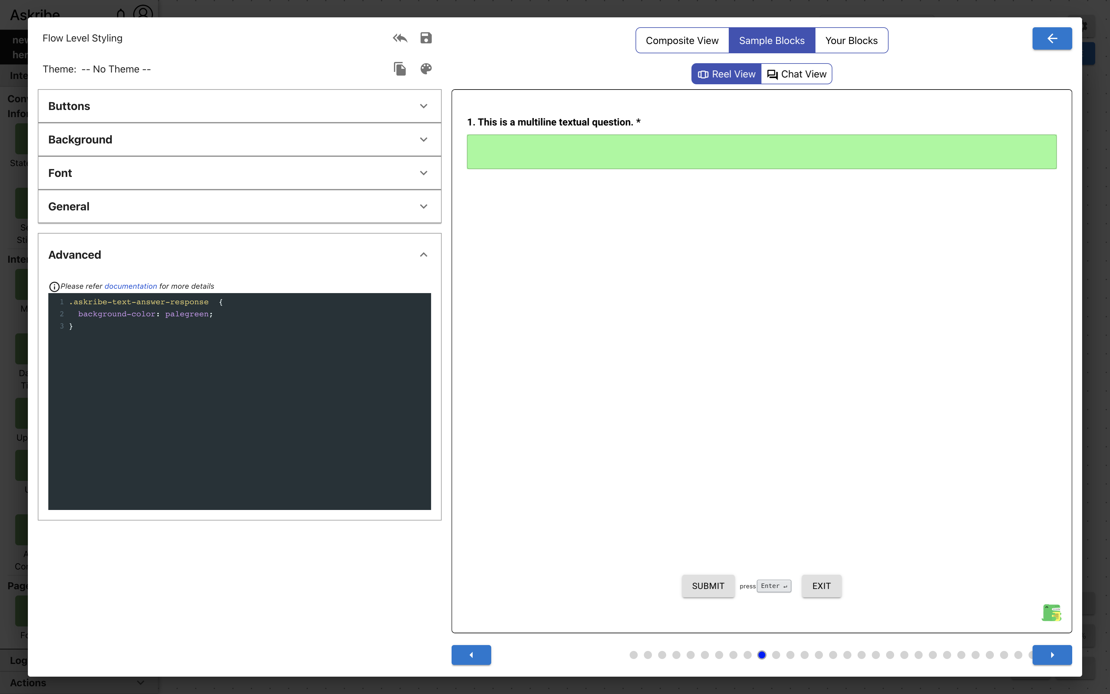
askribe-text-answer-response | Text Answer block text field |
askribe-text-answer-single-line-response | Text Answer block text field, if format type is None and text line type is Single Line |
askribe-text-answer-multi-line-response | Text Answer block text field, if format type is None and text line type is Multi Line |
askribe-text-answer-phone-response | Text Answer block text field, if format type is Phone Number |
askribe-text-answer-email-response | Text Answer block text field, if format type is Email |
askribe-text-answer-url-response | Text Answer block text field, if format type is URL |
askribe-text-answer-numeric-response | Text Answer block text field, if format type is Number |
Example 1
Code
.askribe-text-answer-response  {
    background-color: palegreen;
}
Result
MCQ Block Classes
The following classes are applicable for a MCQ block
| Class Name | Applied To |
|---|---|
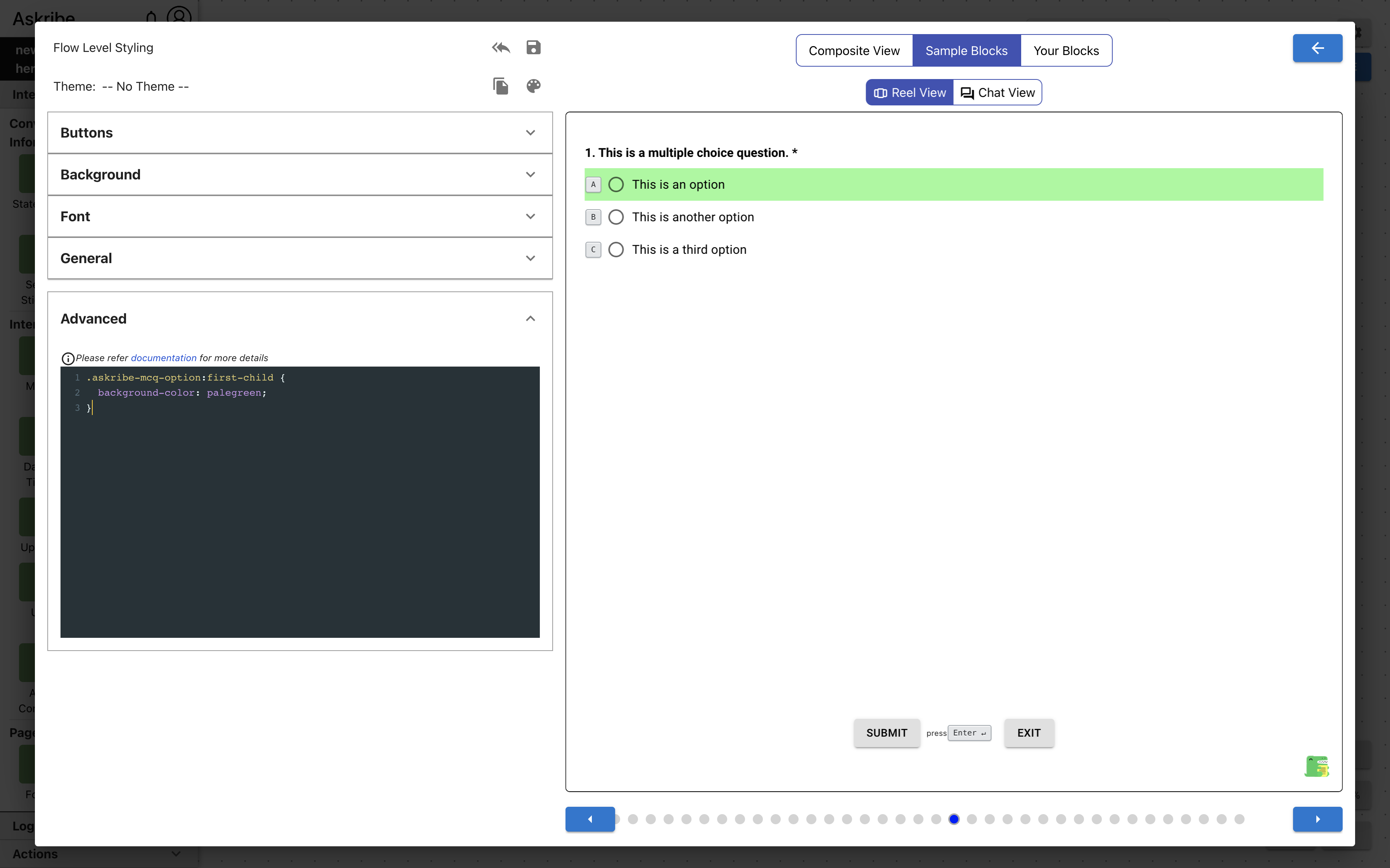
askribe-mcq-option | MCQ block option |
askribe-mcq-list-options-container | MCQ block element containing options / groups |
askribe-mcq-list-option | MCQ block option, if display format is list |
askribe-mcq-dropdown | MCQ block options dropdown, if display format is dropdown |
askribe-mcq-dropdown-menu | MCQ block options popup menu, if display format is dropdown |
askribe-mcq-dropdown-option | MCQ block option, if display format is dropdown |
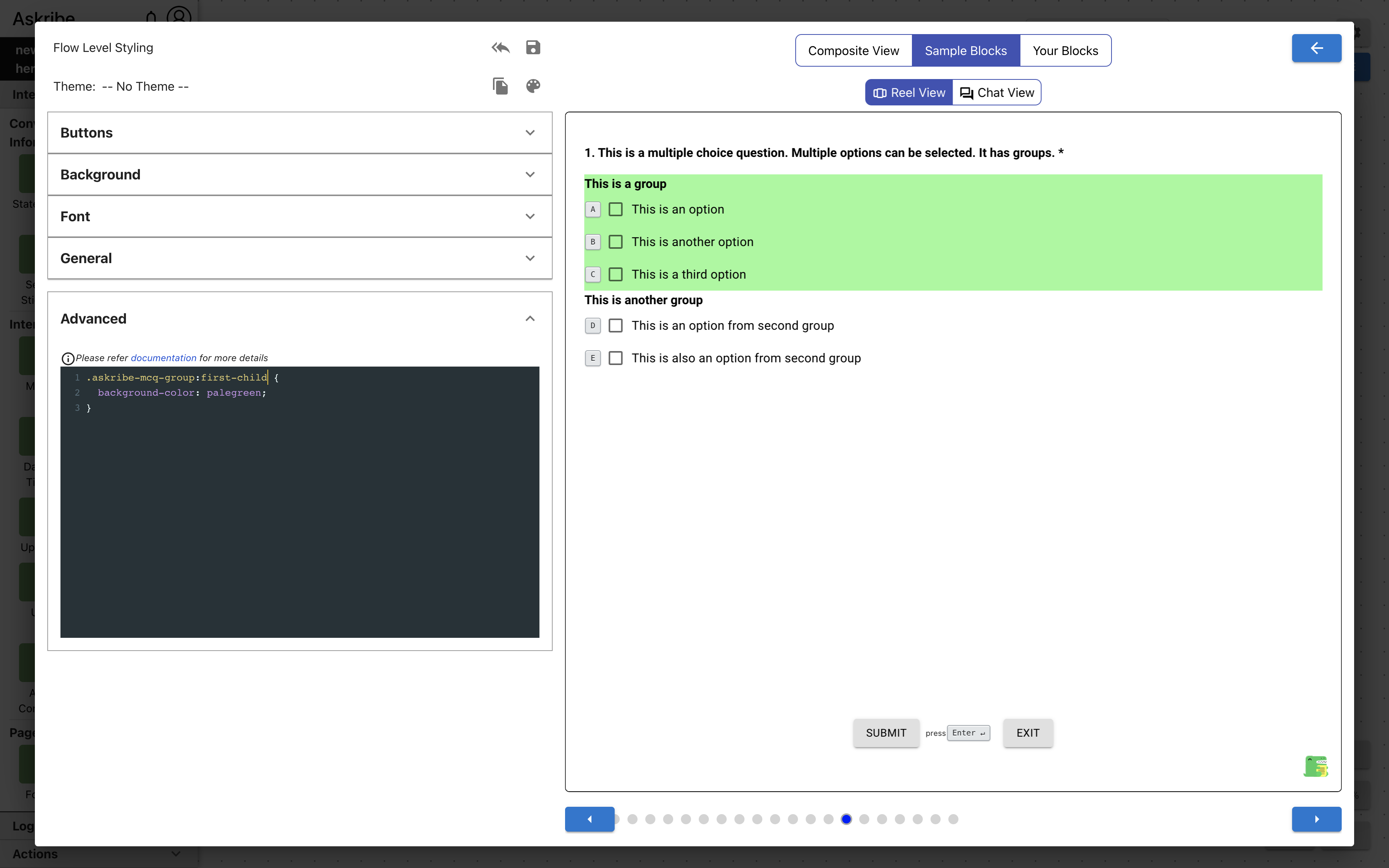
askribe-mcq-group | MCQ block group, if option groups are enabled |
askribe-mcq-list-group | MCQ block group, if option groups are enabled and display format is list |
askribe-mcq-dropdown-group | MCQ block group, if option groups are enabled and display format is dropdown |
askribe-mcq-text-entry | MCQ block text entry field |
Example 1
Code
.askribe-mcq-option:first-child {
    background-color: palegreen;
}
Result
Example 2
Code
.askribe-mcq-group:first-child {
    background-color: palegreen;
}
Result
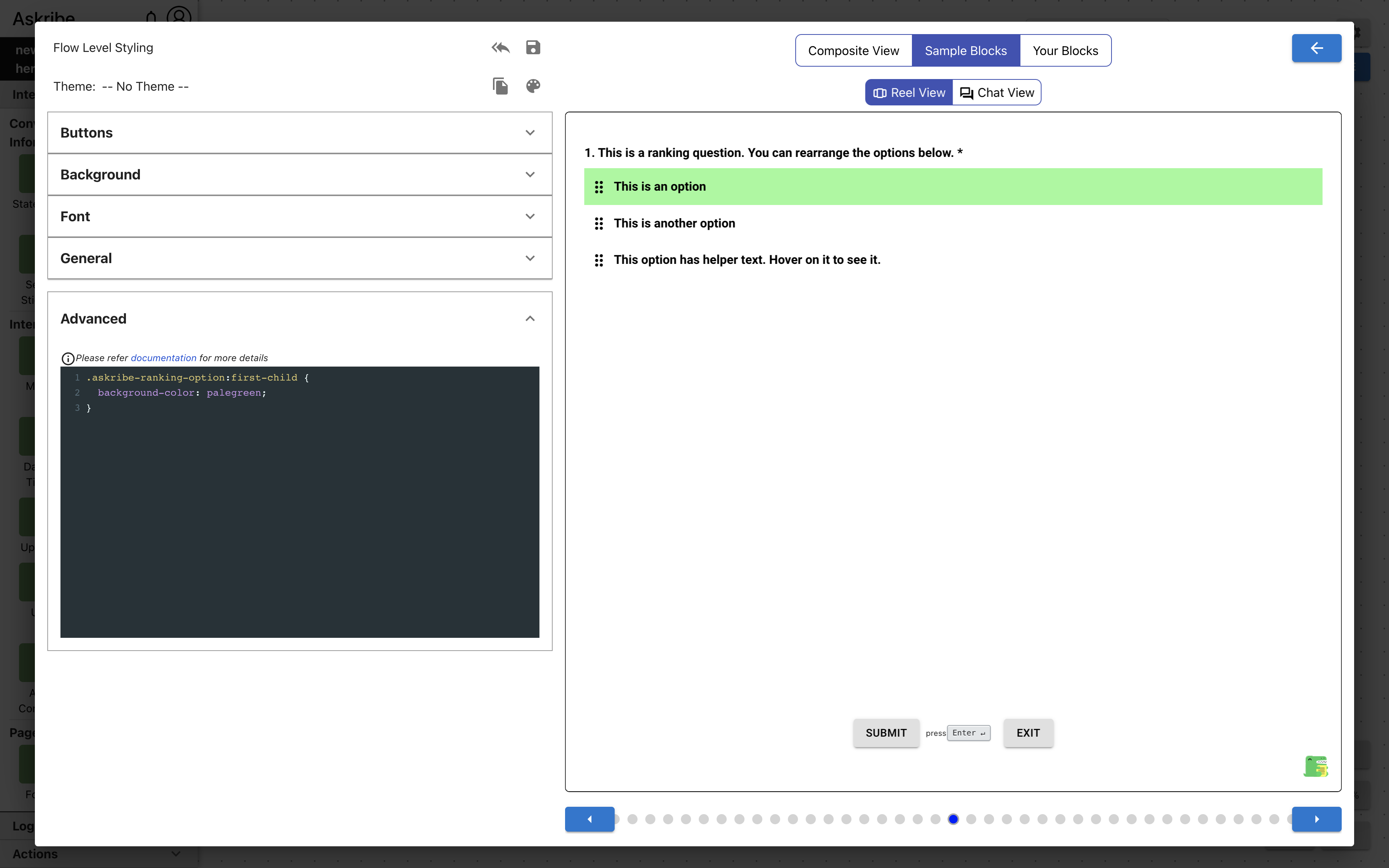
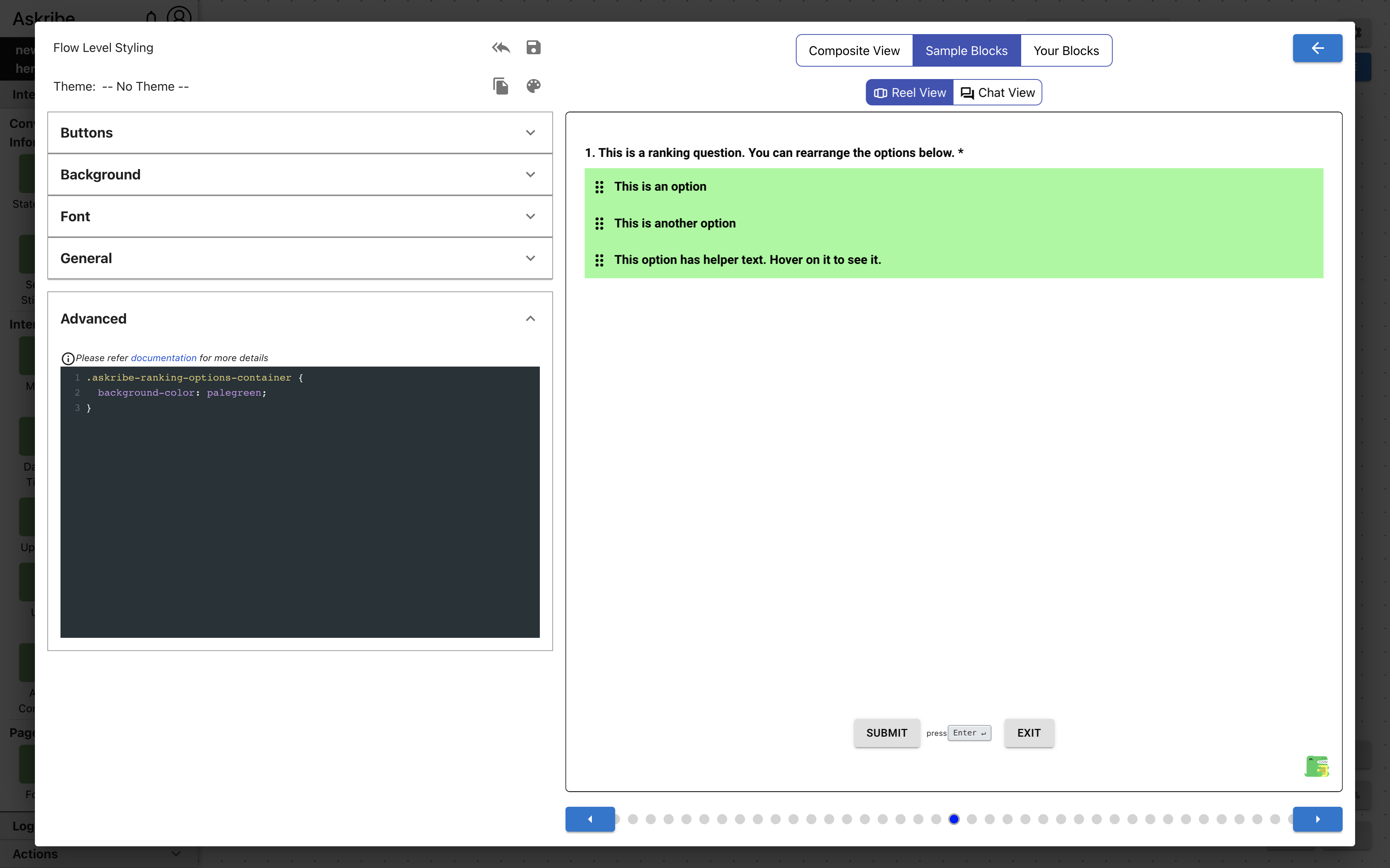
Ranking Block Classes
The following classes are applicable for a Ranking block
| Class Name | Applied To |
|---|---|
askribe-ranking-options-container | Ranking block element containing options |
askribe-ranking-option | Ranking block option |
askribe-ranking-option-drag | Ranking block drag indicator icon |
Example 1
Code
.askribe-ranking-option:first-child {
    background-color: palegreen;
}
Result
Example 2
Code
.askribe-ranking-options-container {
    background-color: palegreen;
}
Result
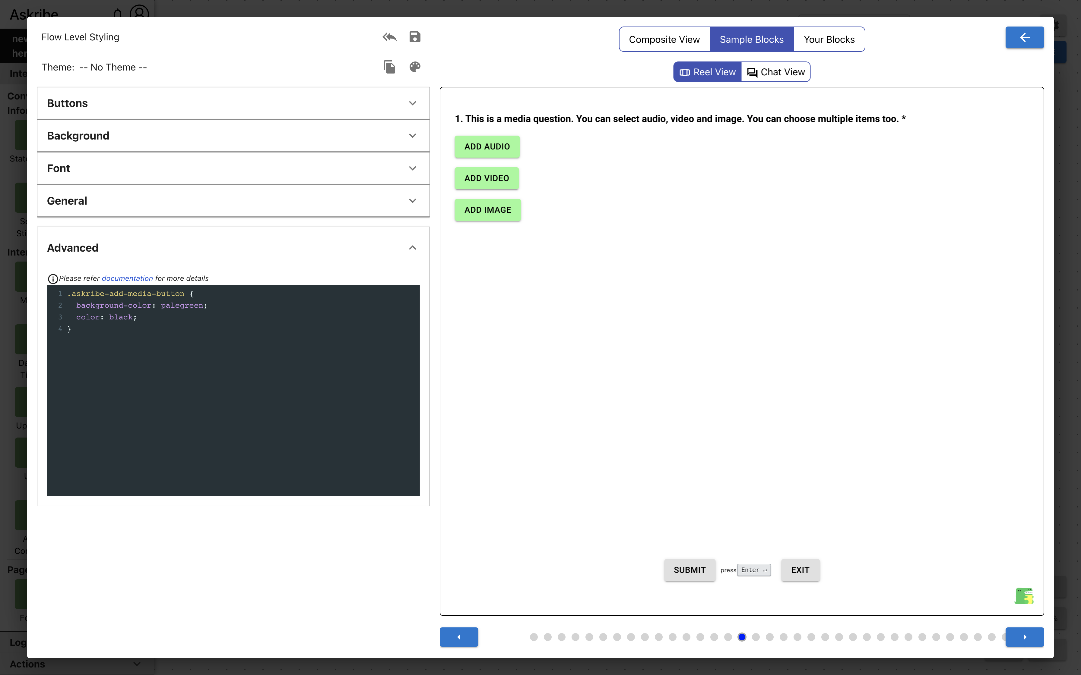
Capture Media Block Classes
The following classes are applicable for a Capture Media block
| Class Name | Applied To |
|---|---|
askribe-media-response | Capture Media block media capture widget, for all media types |
askribe-audio-response | Capture Media block media capture widget, for media type audio |
askribe-video-response | Capture Media block media capture widget, for media type video |
askribe-image-response | Capture Media block media capture widget, for media type image |
askribe-capture-media-btn | Capture Media block media capture widget buttons, for all media types |
askribe-multiple-media-container | The element containing Capture Media block media capture widgets, when Allow Multiple Media is selected |
askribe-add-media-button | Capture Media block add media button. This is applicable only when Allow Multiple Media is selected. This is the button which adds more media capture widgets. |
Example 1
Code
.askribe-media-response {
    background-color: palegreen;
}
Result

Example 2
Code
.askribe-add-media-button {
    background-color: palegreen;
    color: black;
}
Result
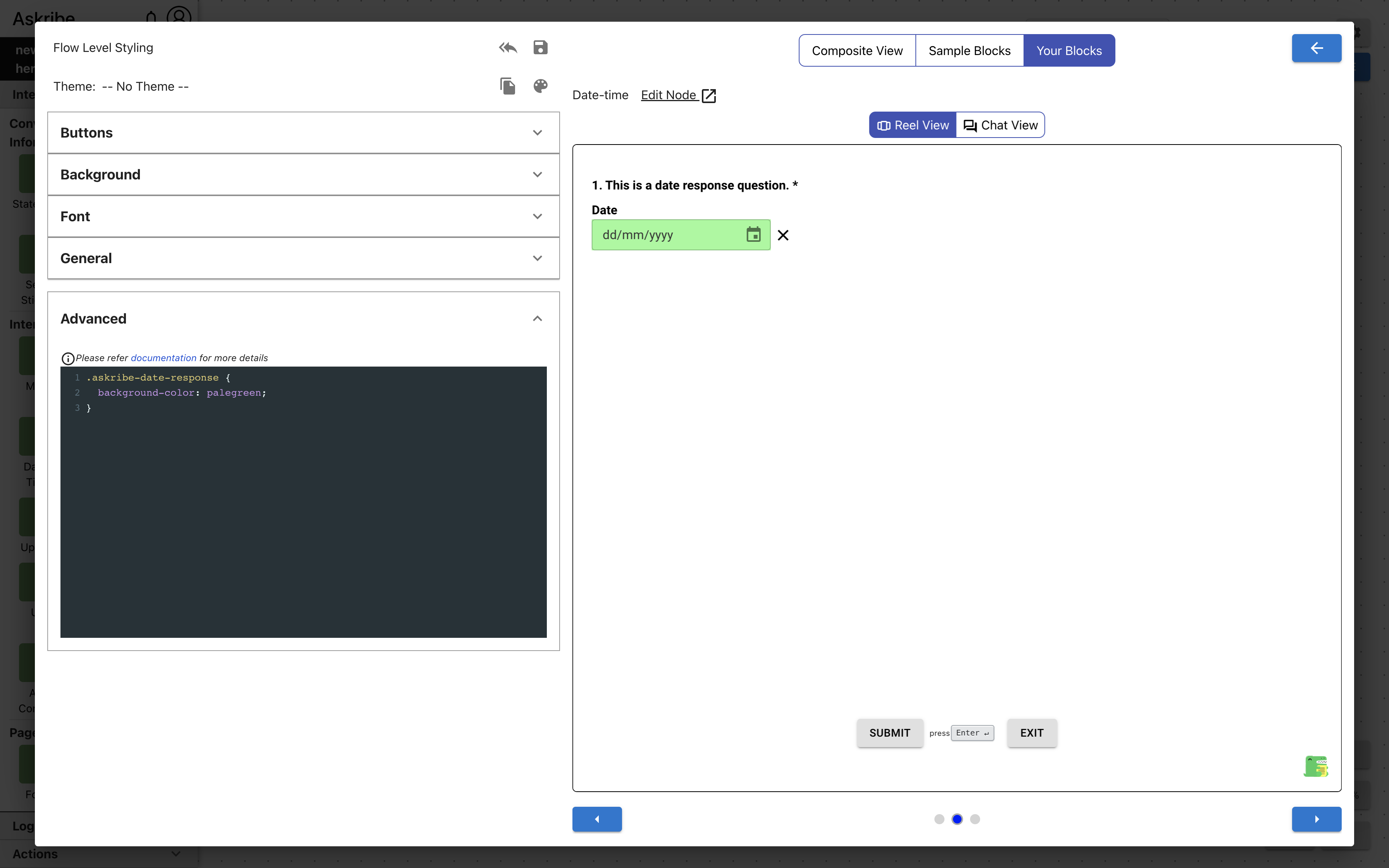
Date / Time Block Classes
The following classes are applicable for a Date / Time block
| Class Name | Applied To |
|---|---|
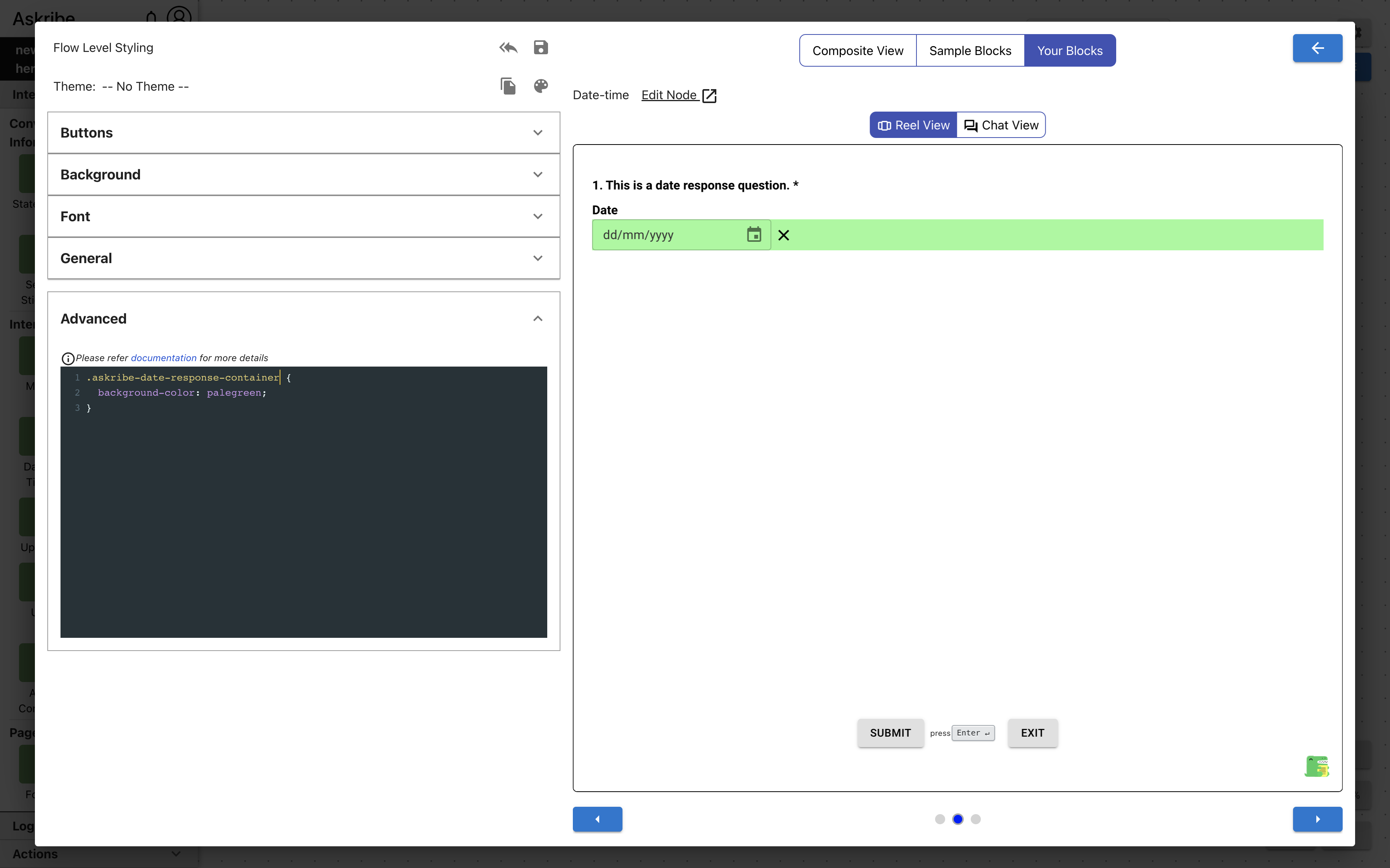
askribe-date-response | Date / Time block response field, if type is Date |
askribe-time-response | Date / Time block response field, if type is Time |
askribe-date-time-response | Date / Time block response field, if type is Date-Time |
askribe-date-response-container | Date / Time block element containing response field and clear button, if type is Date |
askribe-time-response-container | Date / Time block element containing response field and clear button, if type is Time |
askribe-date-time-response-container | Date / Time block element containing response field and clear button, if type is Date-Time |
Example 1
Code
.askribe-date-response {
    background-color: palegreen;
}
Result
Example 2
Code
.askribe-date-response-container {
    background-color: palegreen;
}
Result
Matrix Block Classes
For this block, depending on the width of the consumer, the Matrix block options are displayed to the user in one of two ways.
Desktop View:
- This view is displayed to the user if the width of consumer is greater than or equal to 768px
- In this view, the matrix question is displayed as a table like structure
- The first row contains the column option labels
- The rest or the rows contain row option labels in first column and checkbox / radio input on the subsequent columns for user to answer
Mobile View:
- This view is displayed to the user if the width of consumer is less than to 768px
- In this view, the matrix question is displayed as an accordion like structure
- The row option label is displayed on each of the accordion segments
- Once an accordion segment is opened, all the column option labels are displayed with a checkbox / radio input for user to answer
The following classes are applicable for a Matrix block. Some of the below classes are only applicable for Desktop UI or Mobile UI. If nothing is mentioned, the class is applicable for both views.
| Class Name | Applied To |
|---|---|
askribe-matrix-response-container | The element containing Matrix block options, in Desktop view |
askribe-matrix-header | Matrix block options table first row, in Desktop view |
askribe-matrix-row | Matrix block options table subsequent rows, in Desktop view |
askribe-matrix-mobile-response-container | The element containing Matrix block options, in Mobile view |
askribe-matrix-mobile-collapsible-row | Matrix block accordion segment, in Mobile view |
askribe-matrix-mobile-divider | The divider element between row options, in Mobile view |
askribe-matrix-mobile-selected-answer | The element containing Matrix block checked column and its corresponding checkbox / radio input |
askribe-matrix-row-label | Matrix block row option label |
askribe-matrix-col-label | Matrix block column option label |
askribe-matrix-input | Matrix block checkbox / radio input |
askribe-matrix-checkbox | Matrix block checkbox input. Applicable for single multi Matrix |
askribe-matrix-radio | Matrix block radio input. Applicable for single select Matrix |
Rating Block Classes
The following classes are applicable for a Rating block
| Class Name | Applied To |
|---|---|
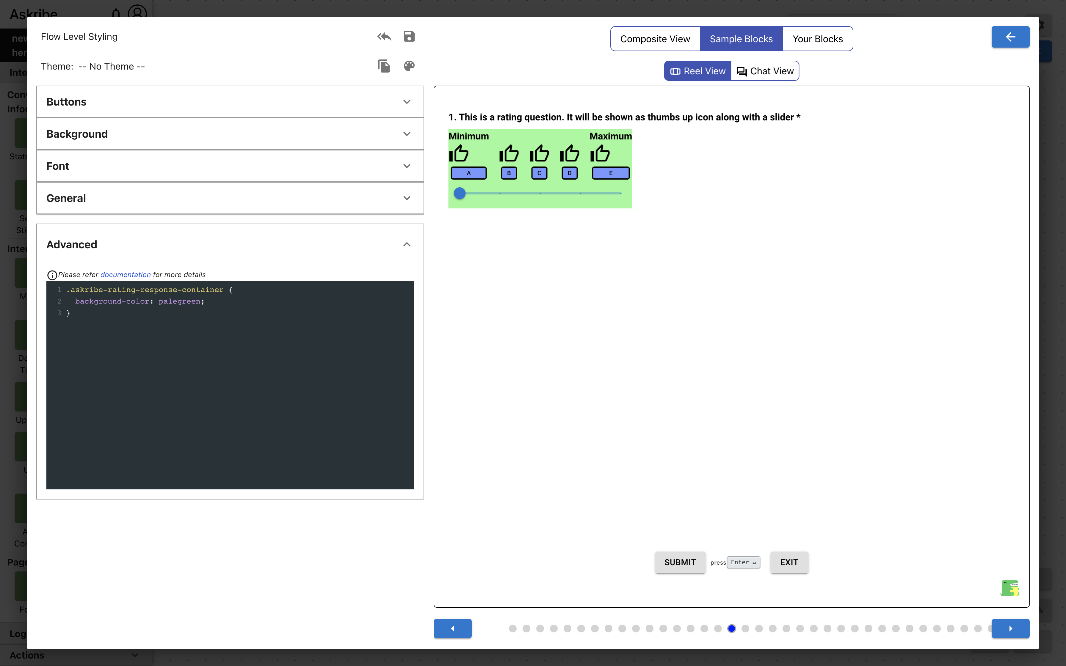
askribe-rating-response-container | The element containing Rating block response |
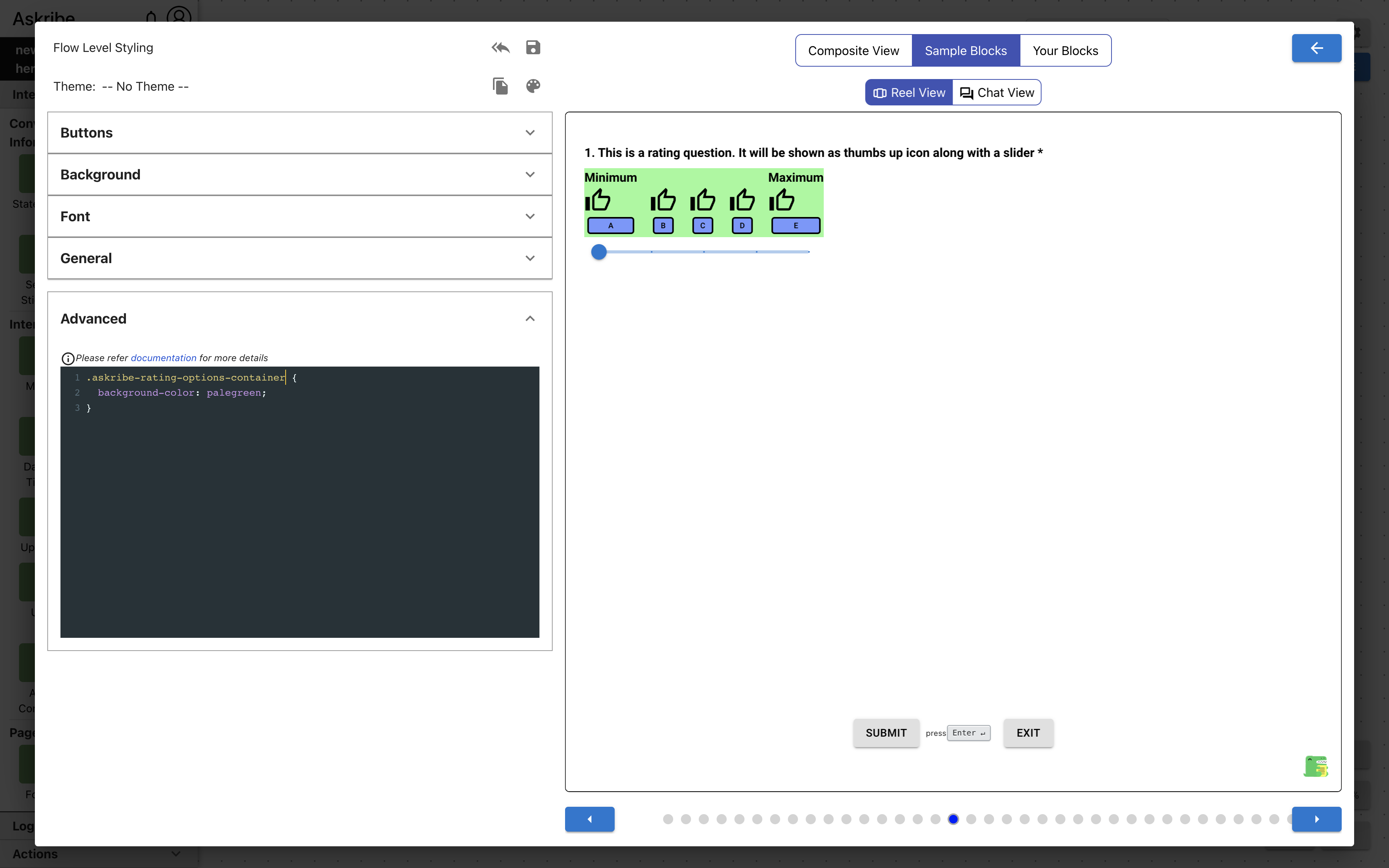
askribe-rating-options-container | The element containing Rating block options |
askribe-rating-slider | Rating block slider |
askribe-rating-left-label | Rating block left label |
askribe-rating-right-label | Rating block right label |
askribe-rating-option | Rating block option |
askribe-rating-option-filled | Rating block filled option. Applicable for options below the selected option are displayed as filled icons |
askribe-rating-option-selected | Rating block selected option |
askribe-rating-option-number | Rating block option, if rating type is Number |
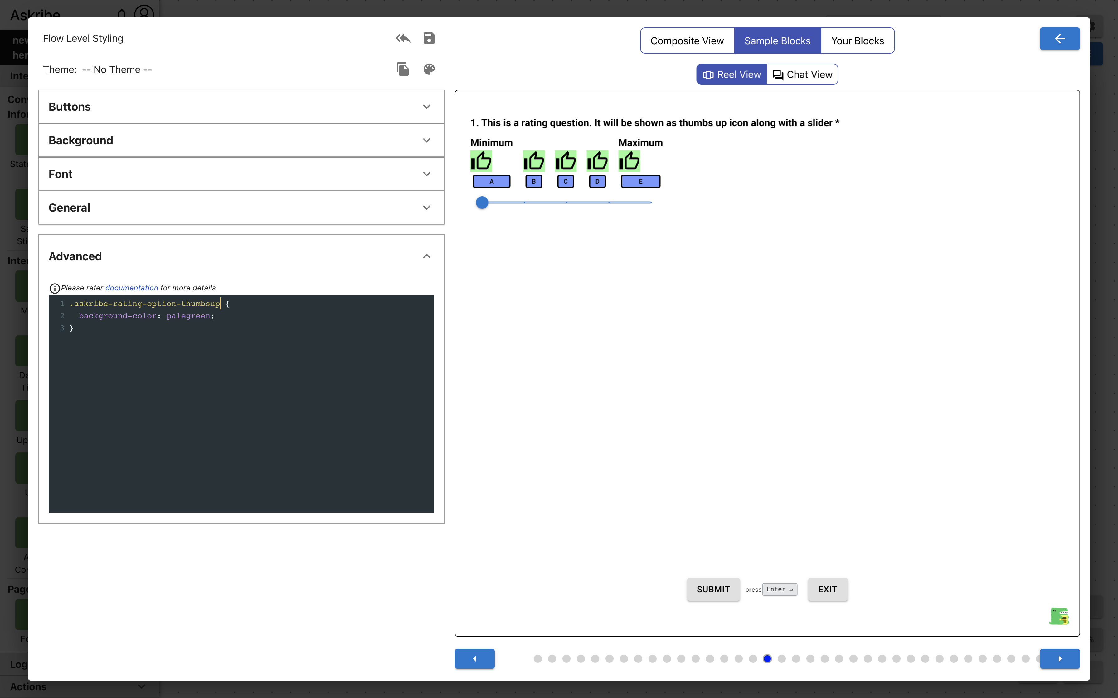
askribe-rating-option-thumbsup | Rating block option, if rating type is Thumbs Up |
askribe-rating-option-reaction | Rating block option, if rating type is Reaction |
askribe-rating-option-lightning | Rating block option, if rating type is Lightning |
askribe-rating-option-stars | Rating block option, if rating type is Stars |
Example 1
Code
.askribe-rating-response-container {
    background-color: palegreen;
}
Result
Example 2
Code
.askribe-rating-options-container {
    background-color: palegreen;
}
Result
Example 3
Code
.askribe-rating-option-thumbsup {
    background-color: palegreen;
}
Result
Signature Block Classes
The following classes are applicable for a Signature block
| Class Name | Applied To |
|---|---|
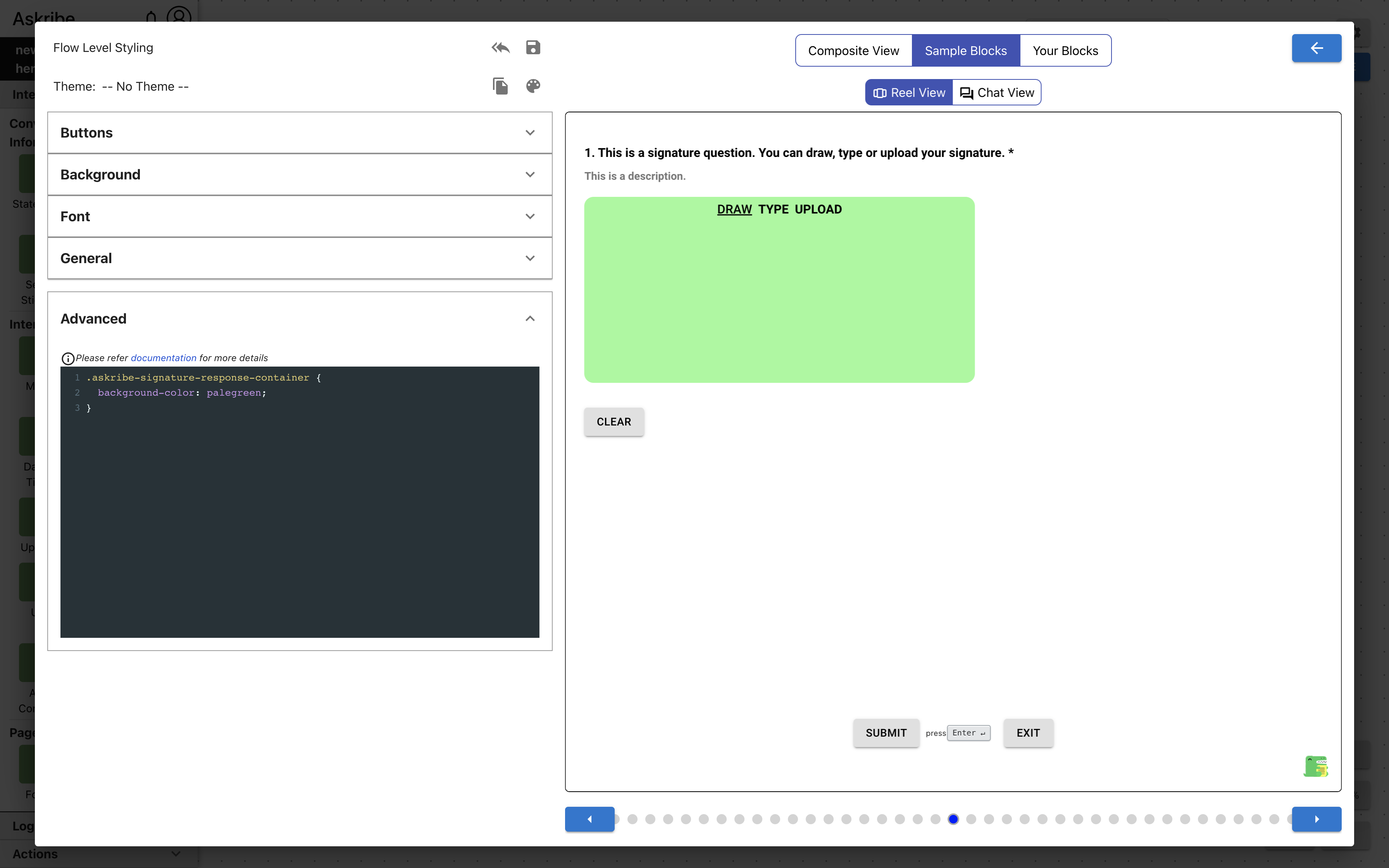
askribe-signature-response-container | The element containing Signature block response |
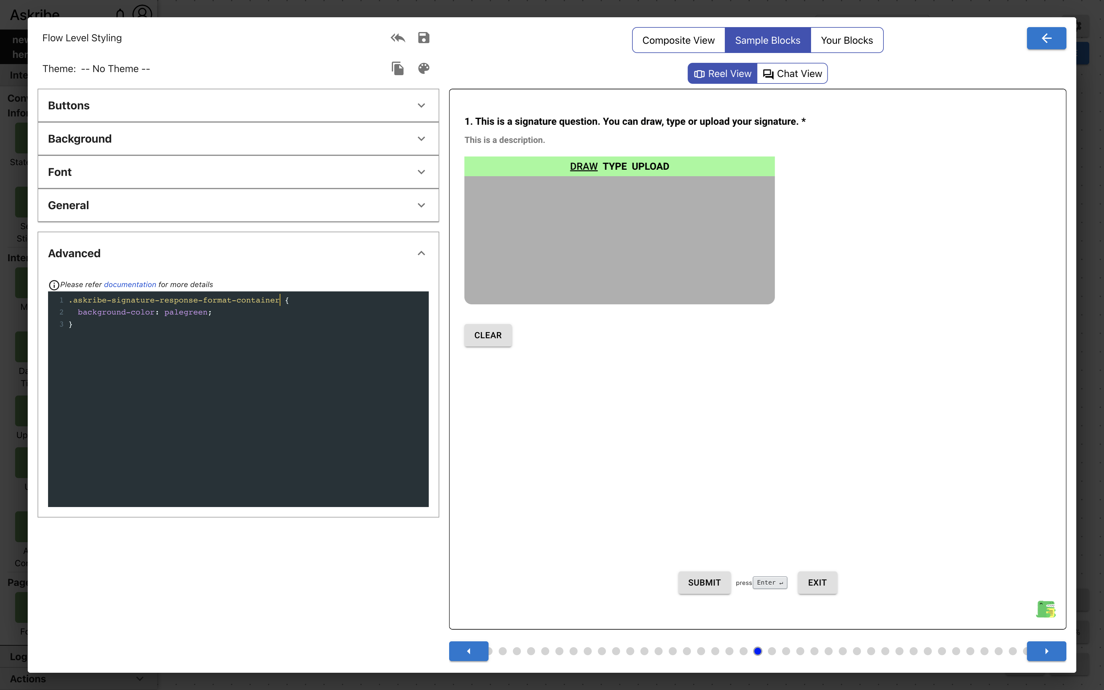
askribe-signature-response-format-container | The element containing the Signature block response type selection tabs |
askribe-signature-response-format-tab | Signature block response type selection tab |
askribe-signature-response-format-tab-selected | Selected Signature block response type selection tab |
askribe-signature-draw | The element containing Signature block drawn response |
askribe-signature-type | The element containing Signature block typed response |
askribe-signature-upload | The element containing Signature block uploaded response |
askribe-signature-clear-btn | Signature block clear response button |
Example 1
Code
.askribe-signature-response-container {
    background-color: palegreen;
}
Result
Example 2
Code
.askribe-signature-response-format-container {
    background-color: palegreen;
}
Result
Upload Block Classes
The following classes are applicable for an Upload block
| Class Name | Applied To |
|---|---|
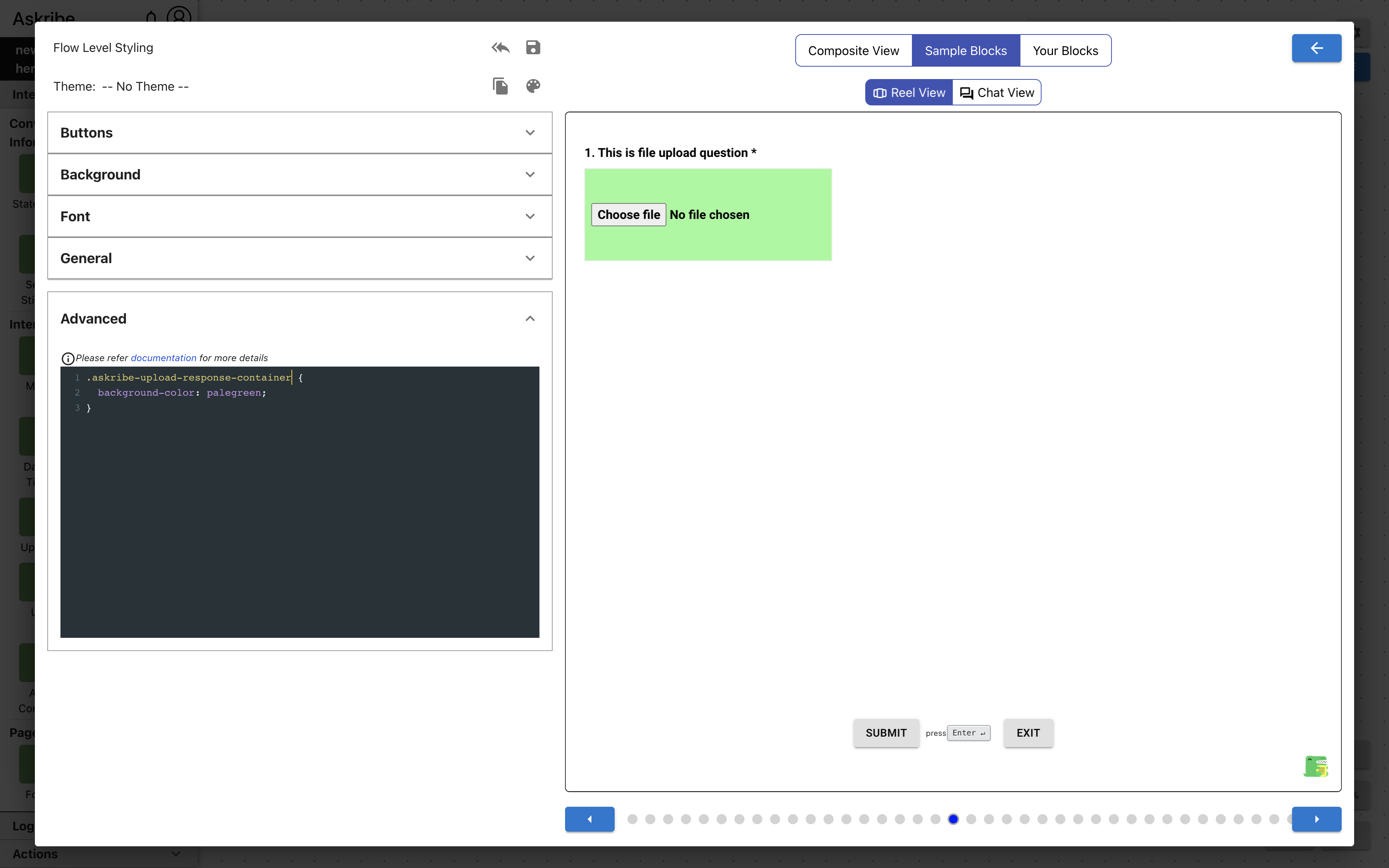
askribe-upload-response-container | The element containing Upload block response |
askribe-upload-uploaded-file | The element containing uploaded file details |
askribe-upload-file-input | The input element used to upload file |
Code
.askribe-upload-response-container {
    background-color: palegreen;
}
Result
Send Sticker Block Classes
The following classes are applicable for a Send Sticker block
| Class Name | Applied To |
|---|---|
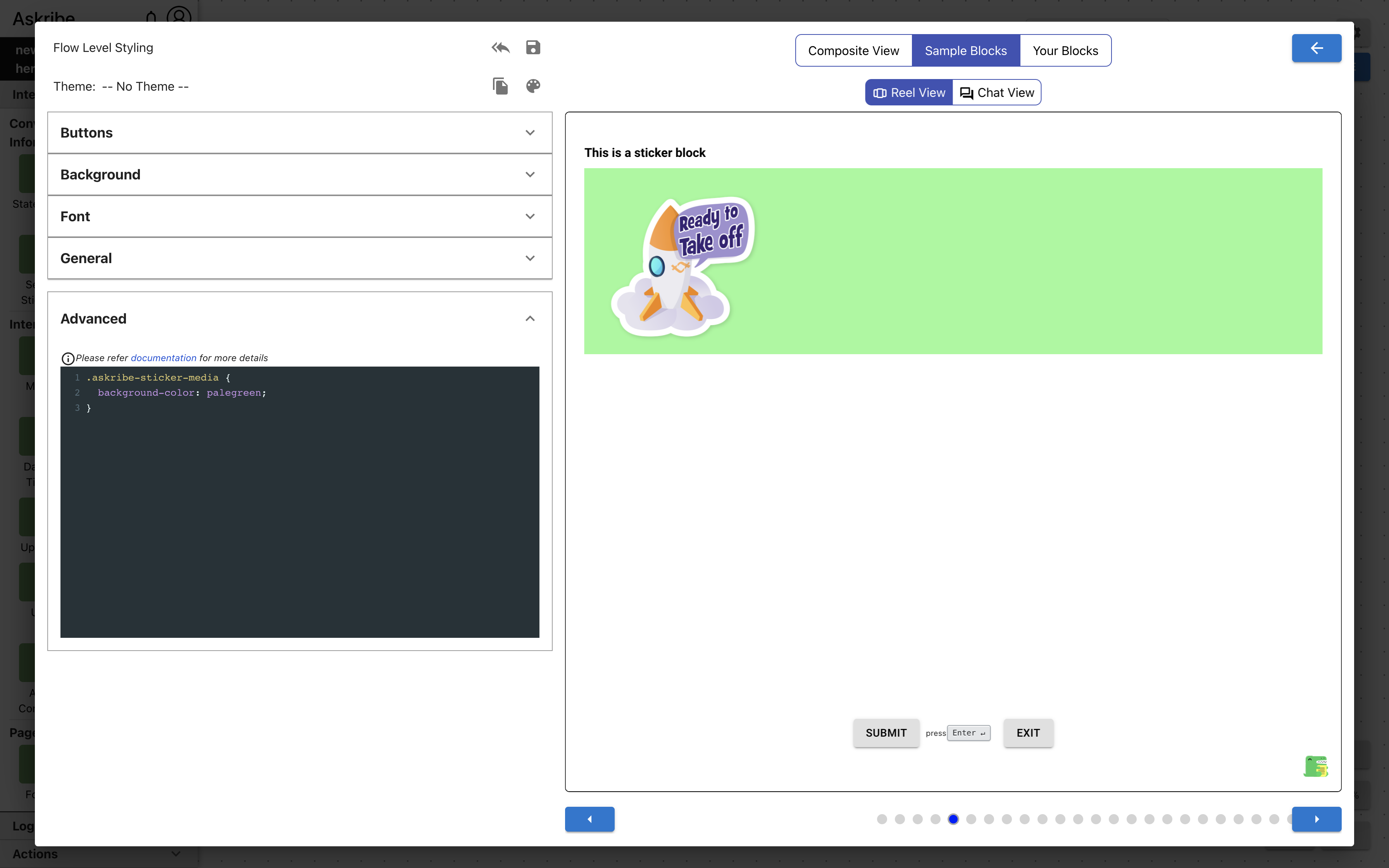
askribe-sticker-media | The element containing sticker media |
Example 1
Code
.askribe-sticker-media {
    background-color: palegreen;
}
Result
Send Contact Block Classes
The following classes are applicable for a Send Contact block
| Class Name | Applied To |
|---|---|
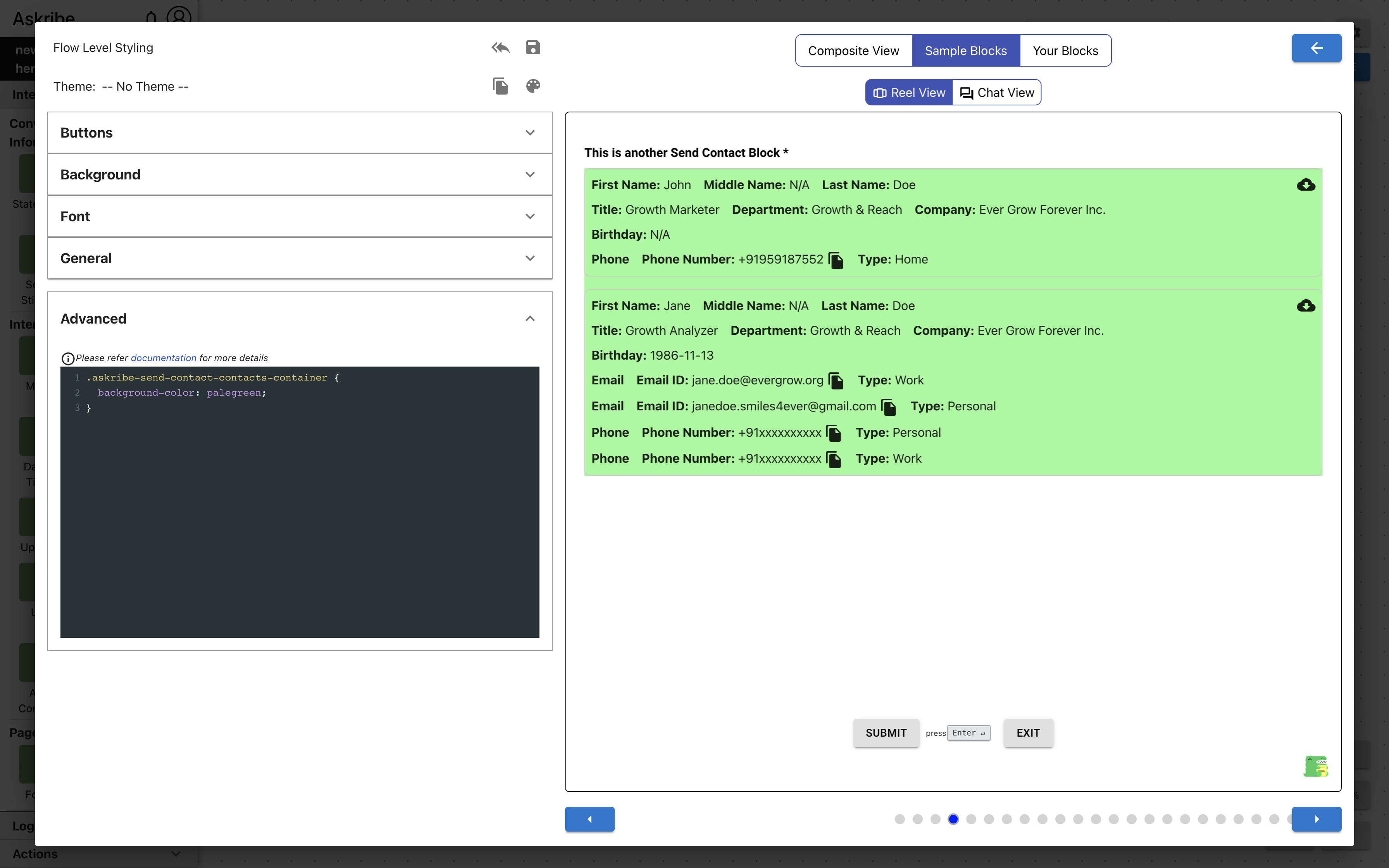
askribe-send-contact-contacts-container | The element containing list of contacts |
askribe-send-contact-contact | The element containing a single contact |
Code
.askribe-send-contact-contact {
    background-color: palegreen;
}
Result

Example 2
Code
.askribe-send-contact-contacts-container {
    background-color: palegreen;
}
Result
Send Location Block Classes
The following classes are applicable for a Send Location block
| Class Name | Applied To |
|---|---|
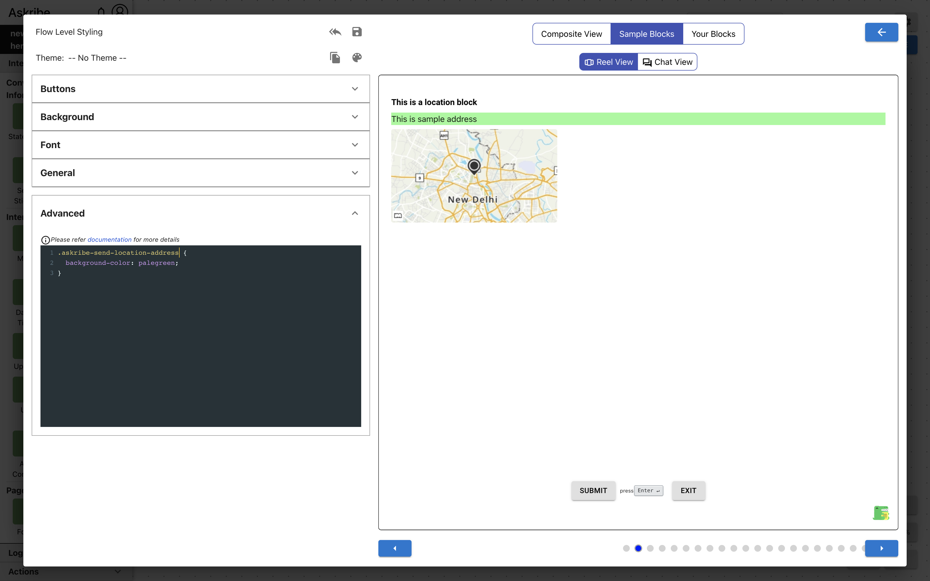
askribe-send-location-address | Send Location block address |
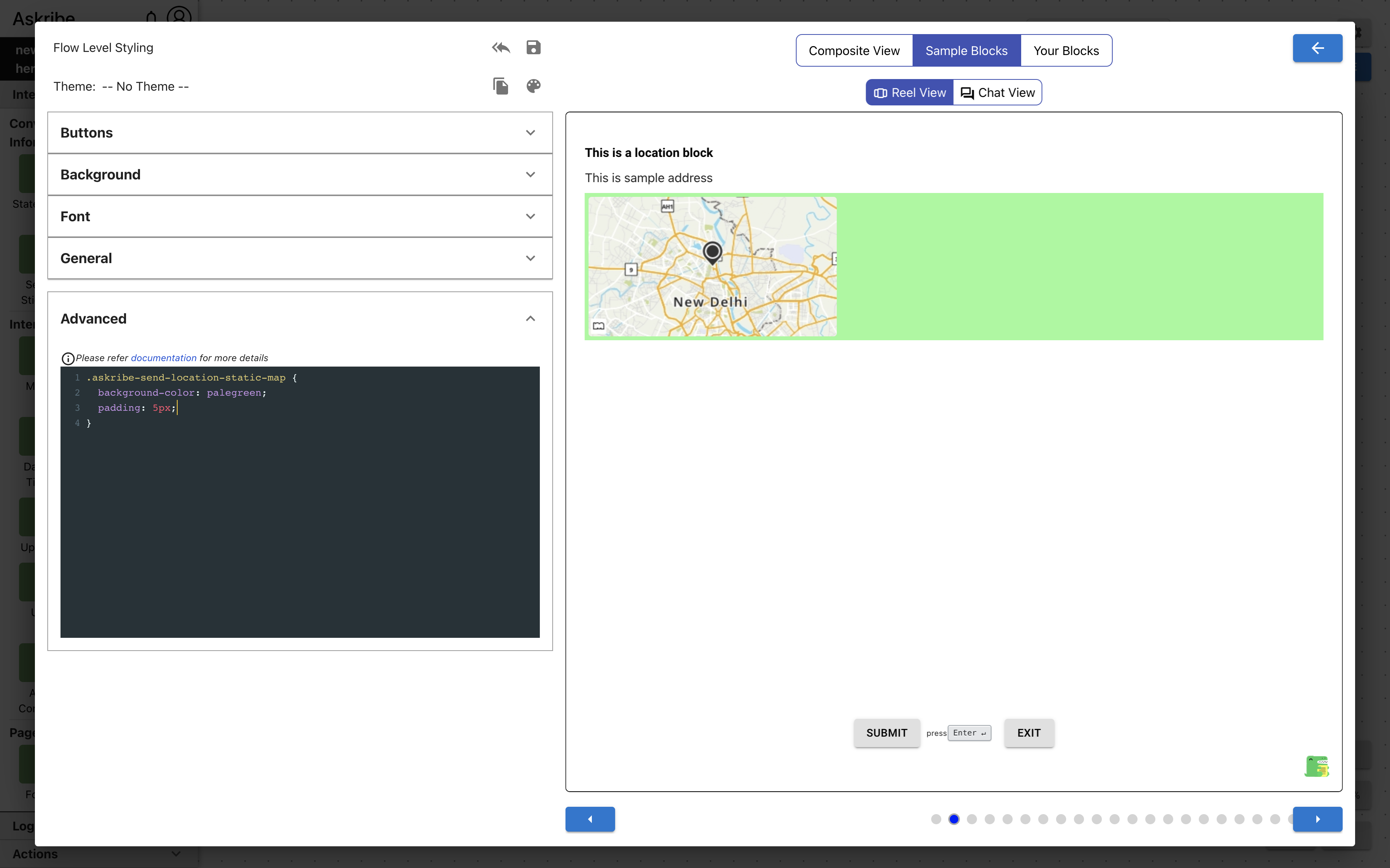
askribe-send-location-static-map | Send Location block static map image |
Code
.askribe-send-location-address {
    background-color: palegreen;
}
Result
Example 2
Code
.askribe-send-location-static-map {
    background-color: palegreen;
    padding: 5px;
}
Result
Captcha Block Classes
The following classes are applicable for a Captcha block
| Class Name | Applied To |
|---|---|
askribe-captcha-answer | Captcha block response |
Ask Location Block Classes
The following classes are applicable for an Ask Location block
| Class Name | Applied To |
|---|---|
askribe-ask-location-response-container | The element containing all Ask Location block response fields |
askribe-ask-location-full-address-field | Ask Location block full address field |
askribe-ask-location-address-response-section | The element containing Ask Location block address fields (street, city, state, zip, country, type) |
askribe-ask-location-address-response-item | Ask Location block address field (street, city, state, zip, country, or type) |
askribe-ask-location-map-section | The element containing Ask Location map fields (interactive map and search location field) |
askribe-ask-location-map-search | Ask Location block search location field |
askribe-ask-location-map | The element containing Ask Location block interactive map |
UX Block Classes
The following classes are applicable for a UX block
| Class Name | Applied To |
|---|---|
askribe-ux-screenshot | The element containing whole response when feedback type is Screenshot |
askribe-ux-screenshot-btn | UX block take screenshot button |
askribe-ux-screenshot-result-container | The element containing UX block screenshot editor |
askribe-ux-screenshot-delete-btn | UX block delete screenshot button |
askribe-ux-feedback-context | The element containing whole response when feedback type is Feedback with context |
askribe-ux-feedback-result-container | The element containing feedback with context image |
askribe-ux-feedback-context-btn | UX block capture feedback with context button |
askribe-ux-delete-delete-btn | UX block delete feedback with context image button |
askribe-ux-screen-record | The element containing whole response when feedback type is Record Screen |
askribe-ux-screen-record-result-container | The element containing screen recording video |
askribe-ux-screen-record-btn | UX block record screen button |
askribe-ux-screen-record-result | UX block screen recording video |
askribe-ux-screen-record-preview | UX block preview video while screen is being recorded |
askribe-ux-screen-record-delete-btn | UX block delete screen recording button |
askribe-ux-text-response | UX block feedback text field (for all three types) |
General Miscellaneous Classes
| Class Name | Applied To |
|---|---|
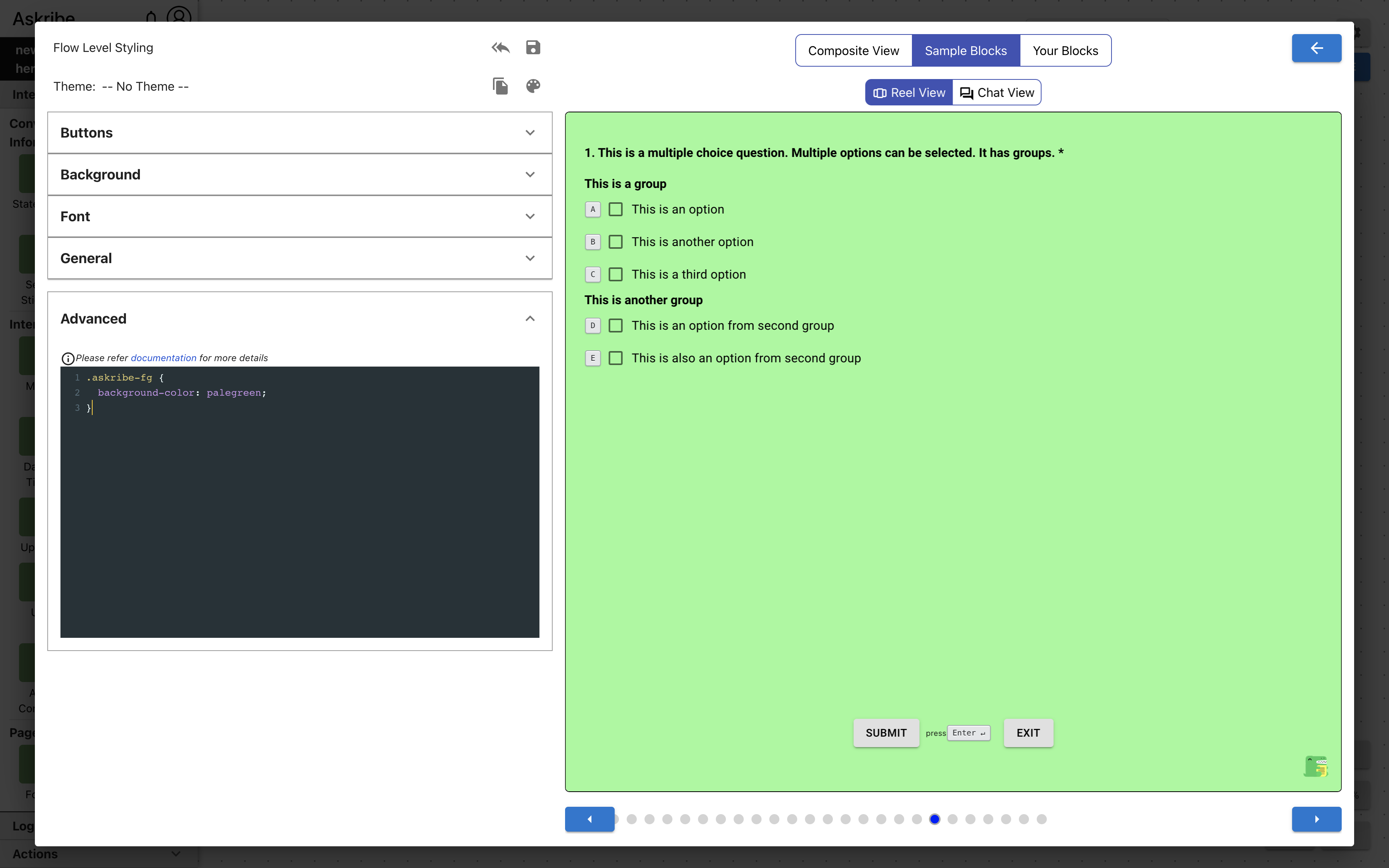
askribe-bg | The element on which the background is applied |
askribe-fg | The element on which the consumer contents are rendered. It overlaps with .askribe-bg if background layout is Full Background. This has a higher z-index than askribe-bg |
askribe-bg-video | The element on which video background is applied |
askribe-header | The header element containing header text and header logos |
askribe-header-text | The header text |
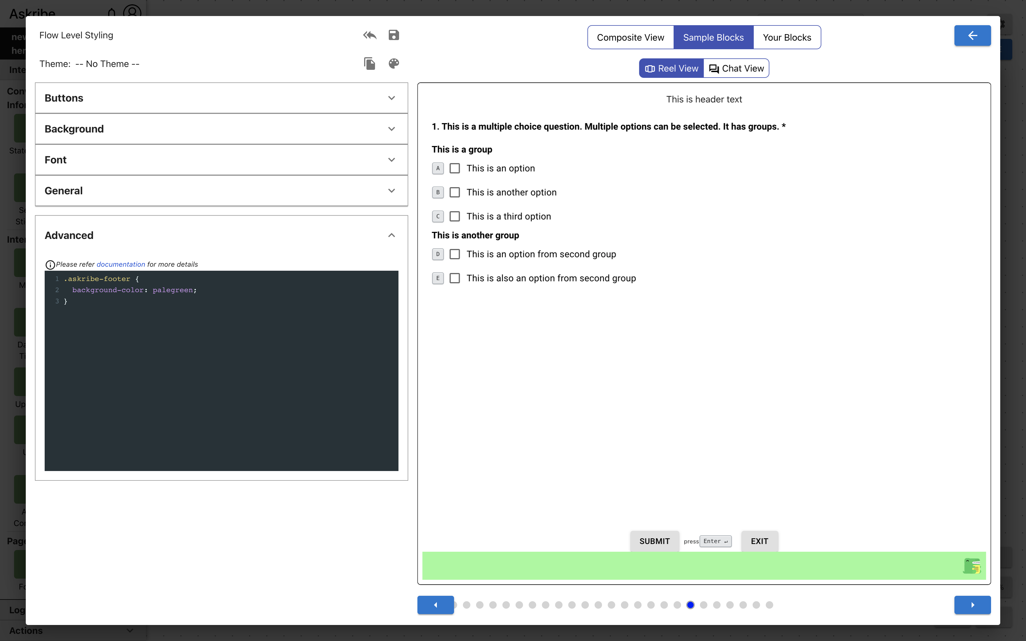
askribe-footer | The footer element containing footer logo, and Fskribe logo |
askribe-action-buttons | The element containing Submit, Skip and Exit buttons |
askribe-content | The element containing consumer contents excluding header, footer and action buttons |
askribe-btn | All buttons in consumer |
askribe-submit-btn | Submit Button |
askribe-exit-btn | Exit Button |
askribe-skip-btn | Skip Button |
askribe-back | Previous question button |
askribe-forward | Next question button |
askribe-title | The title / main content of a block. Not applicable for form title |
askribe-title-container | The element containing title / main of a block and image / video if they exist. Not applicable for form title |
askribe-description | The description of a block |
askribe-keyboard-shortcut | All elements displaying keyboard shortcuts |
askribe-consumer-timer | The element showing elapsed time in consumer |
askribe-brand-logo | Brand logo |
askribe-askribe-logo | Askribe logo |
askribe-consumer | The element wrapping entirety of consumer |
askribe-language-selector | Language selection dropdown |
Example 1
Code
.askribe-fg {
    background-color: palegreen;
}
Result
Example 2
Code
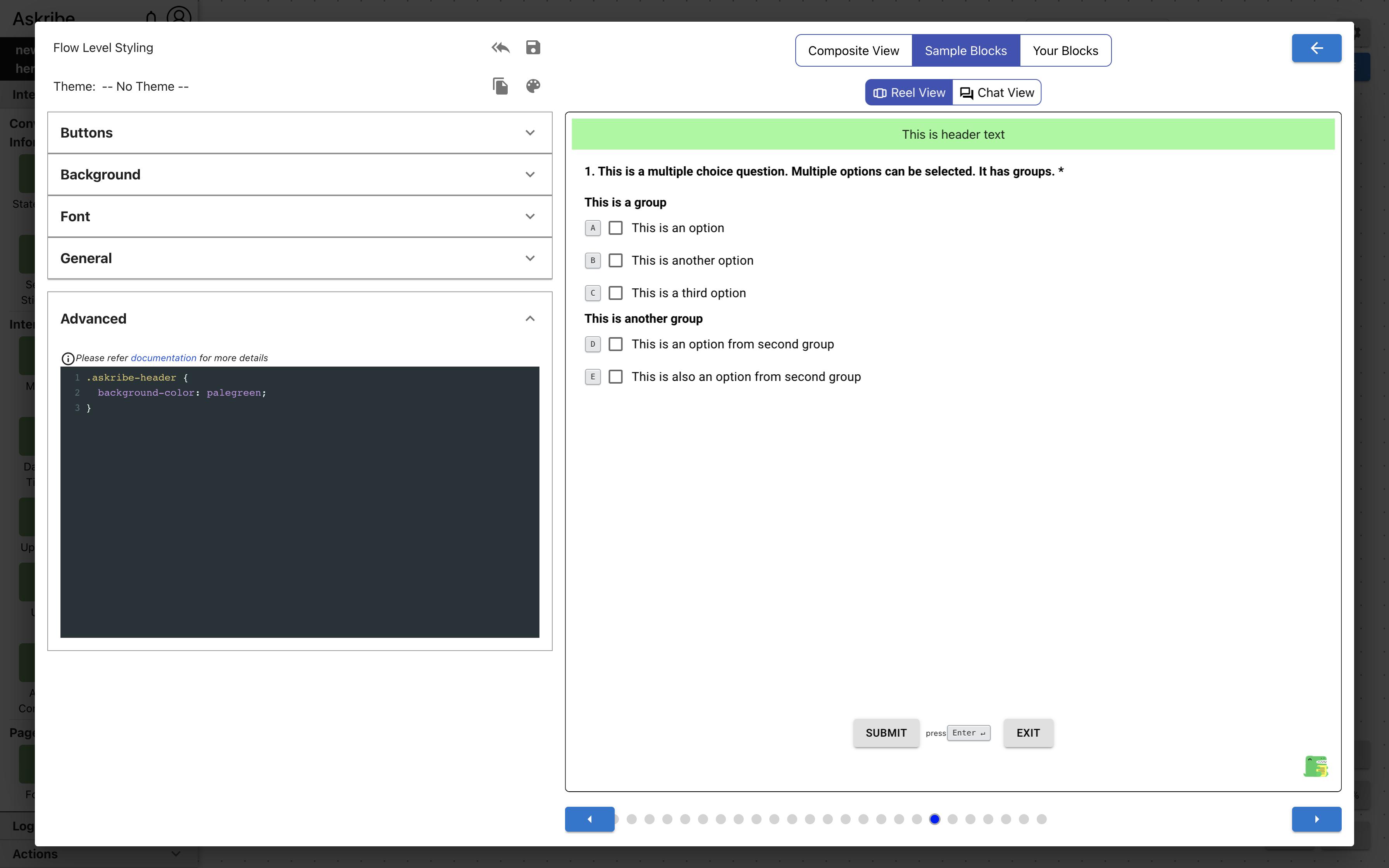
.askribe-header {
    background-color: palegreen;
}
Result
Example 3
Code
.askribe-footer {
    background-color: palegreen;
}
Result
.askribe-title-container includes previous and next block links along with the block title / main content. .askribe-title
only includes the block title / main content.
For blocks which are Form block items, .askribe-title-container and .askribe-title only include the block title / main content.
Additional Notes
Advanced CSS takes precedence over customizations made at same level. For example, if you set font-size to 16px using
GUI controls and font-size to 15px using advanced CSS at Block level, font-size of 15px will be applied to the Block in consumer.
Advanced CSS follows same precedence rules as properties set through GUI controls across levels. For example, if you set font-size to 16px using
GUI controls at Block level and font-size to 15px using advanced CSS at Flow level,
font-size of 16px will be applied to the Block in consumer because Block level styling has higher precedence. For precedence rules refer Precedence Order
If you use !important in Advanced CSS, the precedence order cannot be guaranteed. Using !important is considered a bad practice
and it should be avoided unless absolutely necessary.